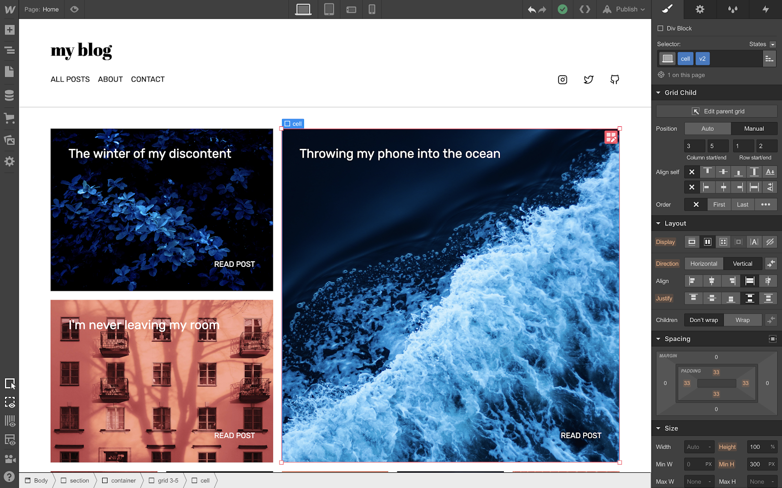
Today, we’re releasing a massive update and series of improvements to grid layout that will make designing responsive, CSS grid-powered layouts easier than ever.
Context: CSS grid 1.0
The launch of CSS grid back in October 2018 took layout in Webflow a dramatic step forward. But it also introduced two issues:
- Clunky responsive design workflows. Manually positioned grid children needed to be adjusted for each breakpoint, and changes to the grid itself across breakpoints required further repositioning of items to fit within the new set of rows and columns.
- No collection list support. Without a governing logic about how to distribute children within the parent grid, there was no way to support a CMS-driven collection list, ecommerce product list, or search result list.
Thankfully, today’s release resolves both of these issues — and introduces a ton more power to CSS grid layout in Webflow.
Where to learn grid
If you still haven’t played around with grid, or you’re looking to get up to speed on the latest updates that come with this 2.0 release, the best place to go is our newly updated grid course on Webflow University.

We’ve also got a series of cloneable, grid-powered layouts that you can grab from our showcase page — some that are brand new and come with tutorial rebuild videos, and others that showcase the manual positioning features from our initial release.
What’s coming next
Today’s release completes our major work on adding CSS grid support to Webflow, but we’ve still got a few pieces still in development: most notably, support for grid areas.
Defining grid areas will allow you to build your layout before adding content, and then once you’ve added content, will make it easier to rearrange large groups of elements on different breakpoints. We’re still in the final development and testing phase for areas, but be on the lookout for more on that soon.
What are you going to build with these new features? To join the conversation about this release, chime in on our forum post or leave a comment below.

